Mar 7, 2024

In any data-driven enterprise, consuming large datasets can be challenging. Often, the datasets are so large that it becomes difficult to extract anything of value from them. That's where data visualization tools come in, turning data into visuals and making it easier to understand data and make critical business decisions.
The global data visualization market is teeming with smart devices, rapid Machine Learning (ML) advancements, cloud computing, and the Internet of things (IoT). The market will reach $7.76 billion by 2023 in revenue. Since every company has to deal with a lot of data, they need data visualization for data analysis and exploration and to make better business decisions.
Many data visualization tools are available to help enterprises interpret and visualize large datasets effectively. Data teams can integrate collaborative solutions into their workspaces for effective data visualization and management within a unified space.
This article will list the top ten data visualization tools but first, let's discuss what a data visualization tool is.
What is a Data Visualization Tool?
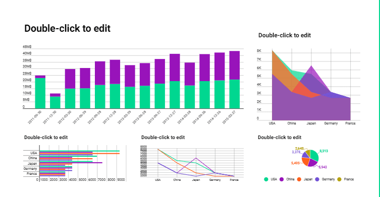
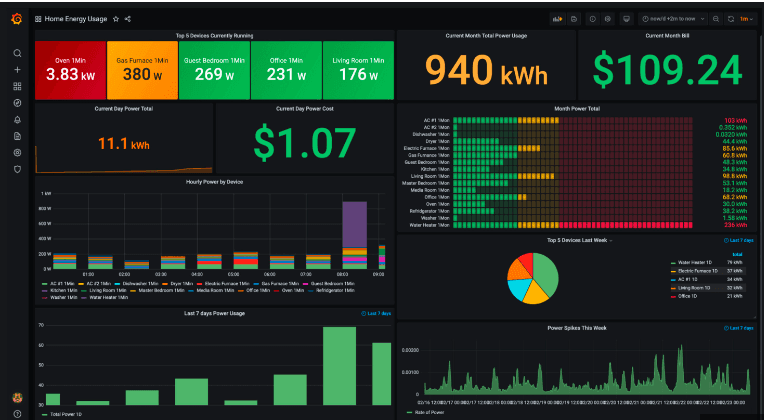
A data visualization tool presents data and information in graphical forms, such as charts, graphs, maps, etc., to make it easier for the human brain to interpret large datasets. Since data presented in visual elements are easy to analyze, businesses can extract actionable insights from this data and make efficient real-time strategic business decisions.
How to Choose the Best Data Visualization Tool?
The choice of a data visualization tool can significantly impact your productivity and business health. Therefore, it is essential to find the best visualization tool for your specific organizational needs. With several different tools available in the market, it gets confusing to choose the best one.
So, here are a few essential aspects to look for in a data visualization tool:
The functionality and performance of the tool
Ease of use and the quality of visualization output
The ability to map data to visualization
The ability to secure data
Maximized clarity through intelligence and minimal visual bloat
Cost to get started
Top Data Visualization Tools
Let’s discuss the ten best data visualization tools that will enable you to visualize data in multiple ways.
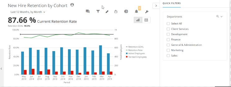
Tableau
Tableau is one of the most popular data visualization and analytics platforms that help users explore data and share valuable insights. Thanks to its flexibility and power to manage data, data exploration, discovery, and visualization are simple with Tableau.
Price: Starts from $70/user/month billed annually for individual users
Pros:
Uses end-to-end encryption and access permissions
Storytelling dashboards
Integration with Slack
Connectivity support with multiple data sources
Cons:
Higher price compared to other tools
Steep learning curve
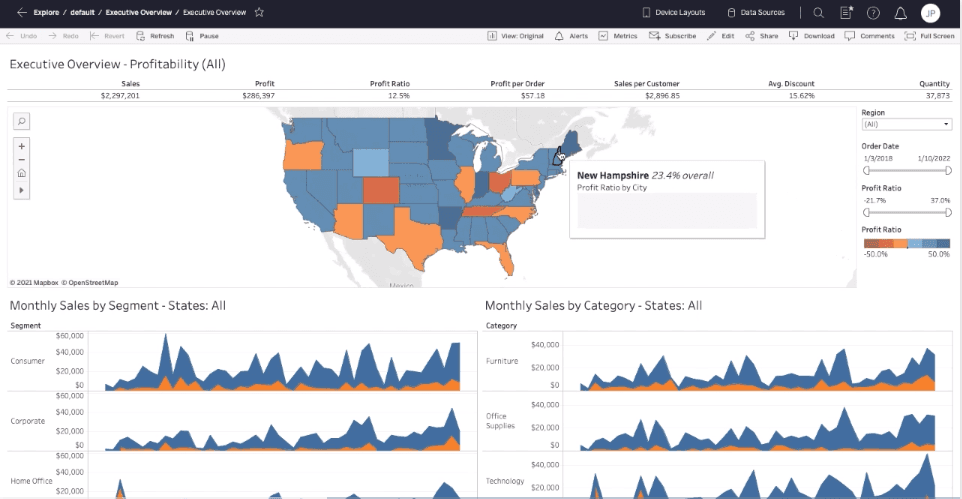
Source: Tableau
Looker
A powerful tool like Looker enables users to visualize data in multiple ways, including charts, graphs, dynamic dashboards, etc. Looker allows users to utilize templates for particular data analysis with its pre-made analytical blocks. It is an easy-to-use visualization tool that offers different types of visualizations, including aster plots, bar gauges, etc.
Price: Looker is a part of Google Cloud. Businesses can get a quote according to their requirements.
Pros
Uses AES 256-bit encryption to secure data connections
Dynamic visuals, including cartesian charts, progression charts, maps, and custom visualizations.
Drag and drop User Interface (UI)
Plugin database offering different visualization types like graphs, charts, etc.
Cons
Inferior customization than other tools
Sometimes gets sluggish due to data-heavy visualizations
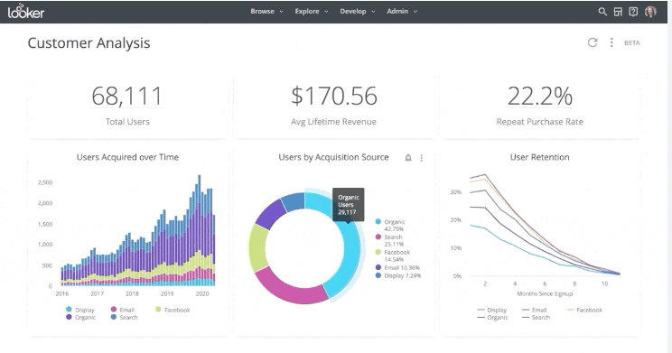
Source: Looker
Google Charts
Google Charts is a free data visualization tool that enables powerful visualizations due to its capability to produce stunning graphical and pictorial data visualization. Also, it is compatible with Android, iOS, and a few earlier versions of Internet Explorer.
Price: Free & open source
Pros
Secure to use
User-friendly tool
Cross-browser compatible, as it uses SVG/HTML5
Compatible with Google products
Cons
Limited support
Lacks customizations capabilities
Requires network connectivity for data visualization
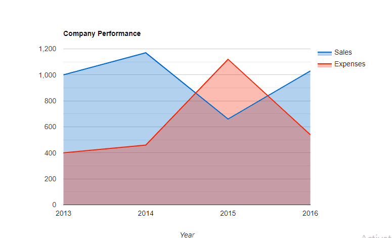
Source: Google Charts
QlikView
QlikView is not just any other visualization tool; it is a data discovery tool, enabling users to create intuitive analytics and report dashboards. In addition to accelerating visualizations, it employs powerful features, including enterprise reporting, analytics, and Business Intelligence Capabilities.
Price: Free for personal use and a free trial for paid version
Pros
Section access security for authorization and authentication
User-friendly UI
Appealing visualizations
Cost efficient
Easy maintenance
Cons
Limited customer support
It doesn't feature drag & drop
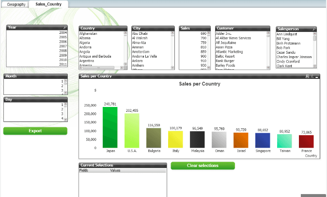
Source: Qlik
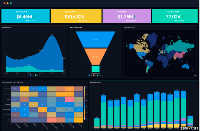
Domo
Domo helps small businesses to understand data and make data-driven decisions through its effective data visualization. With its easy-to-use UI, it enables users to develop custom apps, charts and maps, and other visualizations efficiently. Also, Domo helps organizations control access to data through its governance tools.
Price: You can try Domo for free and get a personalized quote according to your business needs.
Pros
Advanced Security
Unique Social Features
Mobile support
Appealing data visualization
Cons
Price is not mentioned; you have to contact them to get a customized quote.
Non-intuitive user interface
Source: Domo
Zoho Analytics
Zoho Analytics, also known as Zoho Reports, is a data visualization tool that features services like Business Intelligence and online reporting. Thanks to its drag-and-drop interface, users can create dashboards and insightful reports using several visualization tools.
Price: Free version available. The basic plan starts from $22/month/billed annually with a free trial.
Pros
Advanced security
Augmented analytics
Prompt customer support
Features functionalities like email scheduling and report sharing
Cons
Costs extra for premium support
Dashboards may get confusing due to large datasets
Source: Zoho Analytics
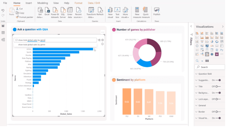
Microsoft Power BI
Microsoft Power BI is a popular data visualization tool available for on-prem installation and cloud deployment. It integrates with several Microsoft products and services, including Excel, Teams, Outlook, etc., making it a versatile solution for enterprises.
Price: Free version available. The paid version starts from $13.70/user/month/
Pros
High-grade security
No limits to speed or memory
Microsoft Products compatible
Personalized, rich dashboard
Cons
Heavy CPU usage
The desktop version is not compatible with Mac
Source: Microsoft Power BI
D3.js
D3.js is a "JavaScript library and framework" for manipulating documents based on data. It uses HTML, SVG, and CSS to bring data to life and creates visualizations by binding the data and graphical elements to the Document Object Model (DOM).
Price: Free & open source
Pros
Provides tools to non-programmers to visualize data
Focused on web standards
Advanced & customizable library
Cons
Slow DOM manipulation for large entries
Source: Github
Infogram
Infogram is a fully featured data visualization tool that enables drag-and-drop features for even non-designer users to create visualizations. With its intuitive visualization capabilities, users can create content, such as marketing reports, social media posts, infographics, and more.
Price: Free version with basic features. Paid plan starts from $19/user/month
Pros
TLS-grade security
Team collaboration
Rich graphic library
Drag-and-drop editor
Cons
Few limitations to custom-made designs
Few built-in sources than other tools
Source: Infogram
Grafana
Grafana is a free and open-source data visualization and analytics tool that lets users create dynamic dashboards and other visualizations. It enables users to see data via graphs and charts unified in one or multiple dashboards.
Price: Free & open source. Grafana Pro starts from $8/month/user
Pros
High-standard data privacy & security
Dynamic dashboard creations
Enables work with mixed data feed
Connects with every possible data source
Cons
limitations on dashboard organization
limited data type visualizations
Source: Grafana
Enhance Your Business Visualization with Sherloq
Sherloq is a "SQL-centric collaboration platform" for data users; a simple add-on that can be integrated with your existing workspace, including most of the top visualization tools, such as Tableau and Looker. With Sherloq, you get everything in a unified platform, ensuring efficient workflow. This add-on lets you collaborate with your teammates, share codes and dashboards, and alerts you on similar dashboards.
Its "Add a query" option allows you to save repetitive SQL code or queries. Also, you can search for any code from your query history that Sherloq has saved automatically. Sherloq enables every data consumer to find the data and dashboard without dependencies on others, making the data self-served. Enhance your productivity with Sherloq by spending less time managing data and benefiting from self-served data.
Contact us to learn more about its features, or try Sherloq for free.
Get Sherloq Free